


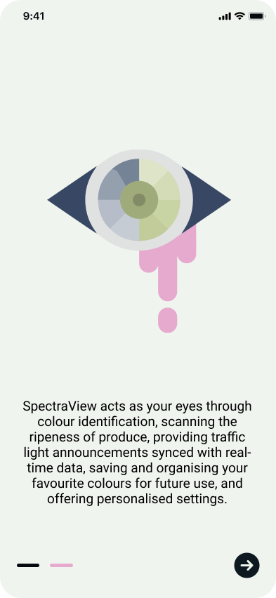
SpectraView

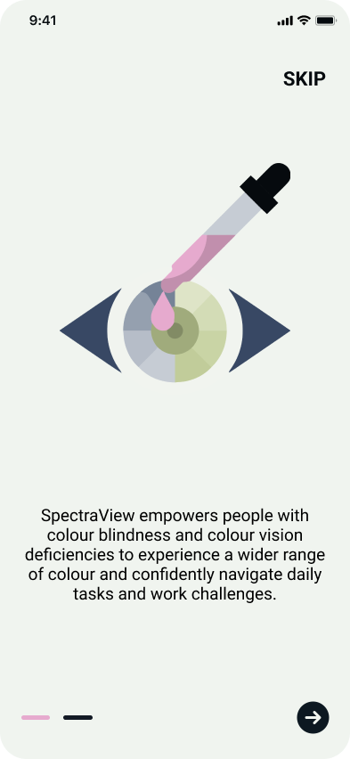
SpectraView serves as the eyes for colour blind and colour vision deficient users, empowering them with a broader spectrum of information to navigate daily tasks and work tasks.
Duration
4 weeks

Role
UI designer, UX researcher

Team
Me

Tools
Figma, Illustrator
WHAT DOES INCLUSIVE DESIGN MEAN TO ME?
I first encountered the concept in class while learning about positionality and how those in power define design. We discussed case studies like biased airport scanners with algorithms that only recognise binary genders, leading to invasive pat-downs, and building access barriers for wheelchair users. Coming from a privileged background, these were minor design considerations with a significant impact that I'd never considered.
I wanted to change that then and there.
This truly altered my perspective, changing how I look at the world around me and impacting the kind of designer I wanted to become. Recognising my shortcomings, I wanted to be more intentional in practising inclusivity and accessibility in my designs. It’s become an important design value to me.
PART 01
Project Overview
WHAT’S THE PROBLEM?
For many of us, we couldn’t imagine a world without colour, but for 300 million around the world, that is their reality (colourblindness.org, 2024). Colour blindness or colour vision deficiency (CVD) is genetic and currently incurable, impacting success and quality of life.
Challenges include:
Difficulty distinguishing specific colours (e.g., red/green, blue/yellow).
Struggles with everyday tasks like matching clothes, reading maps, and interpreting traffic lights.
Limited career options due to colour vision requirements in certain professions.
Frustration and social isolation due to misunderstandings and lack of awareness.
While solutions like corrective lenses and assistive technology exist, effectiveness varies and they can be costly, limiting access.
HOW DO WE ASSIST COLOURBLIND USERS WITH SUCH NUANCED AND DIVERSE EXPERIENCES?
Hearing about these problems from research and colour blind friends, I was driven to help mitigate these challenges and empower individuals facing colour blindness and CVD by creating SpectraView.
Unlike existing solutions, which often focus solely on colour identification, SpectraView tackles everyday tasks like choosing ripe produce and navigating traffic lights, while also offering:
Extensive customisation: Tailored functionalities cater to diverse needs and severity levels of color blindness/CDV.
Industry-specific features: SpectraView empowers users in professional settings, with features like saved colour palettes for designers and traffic light announcements for drivers.
SpectraView goes beyond simply identifying colours. It empowers users across daily life and professional settings, offering a truly inclusive solution.
1. Advanced Colour Identification:
AR Color Picker: Capture or upload images, identify specific colours using a crosshair, and save them.
Multiple Modes: Adjust for texture, contrast, and gauge confidence based on lighting.
2. Enhanced Daily Life:
Smart Scanner: Analyse produce for detailed ripeness information.
Enhanced Navigation: Receive voice-guided directions with traffic light announcements and wait times.
3. Professional Empowerment:
Saved Colours: Organise saved colours into personalised palettes.
4. Tailored Experience:
Settings: Personalise the app based on your type of colour blindness, industry, and goals.
I adopted the double diamond design process, enabling a structured exploration of the problem followed by iterative development of potential solutions.
However, I discovered that the decision process isn’t always a straightforward journey and involves tweaks and adjustments to adapt to the uniqueness of problems and solutions.
PART 02: DISCOVER
Understanding the User & Space
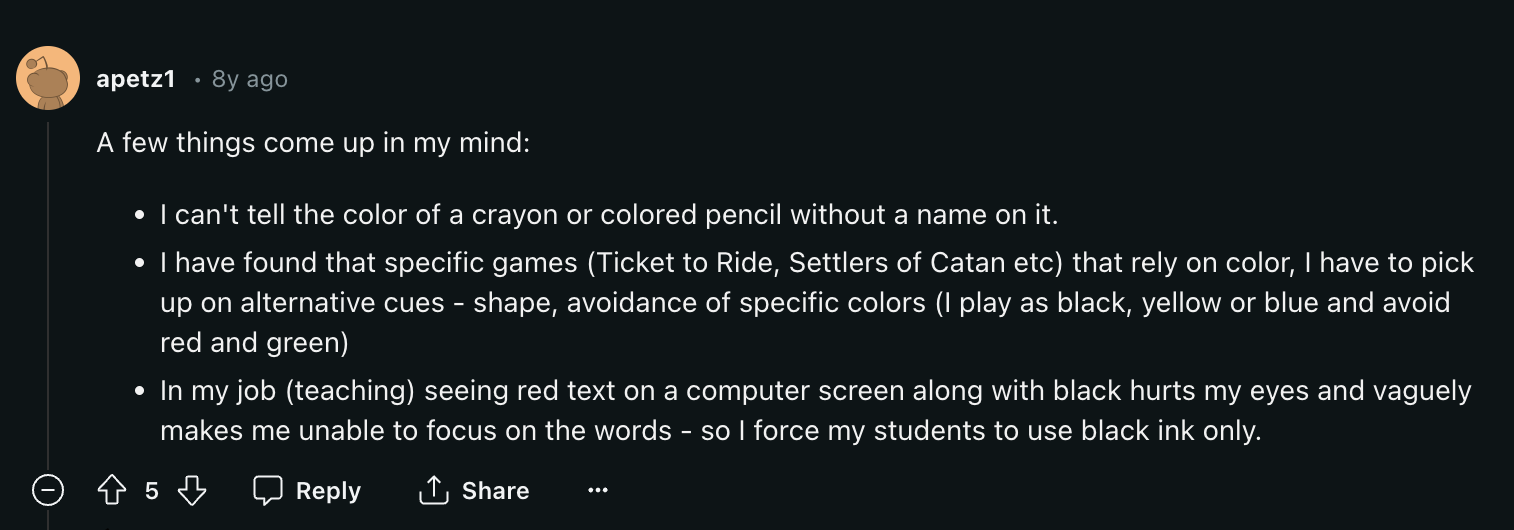
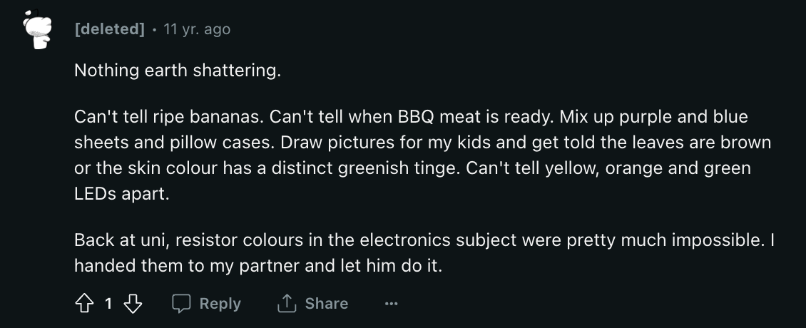
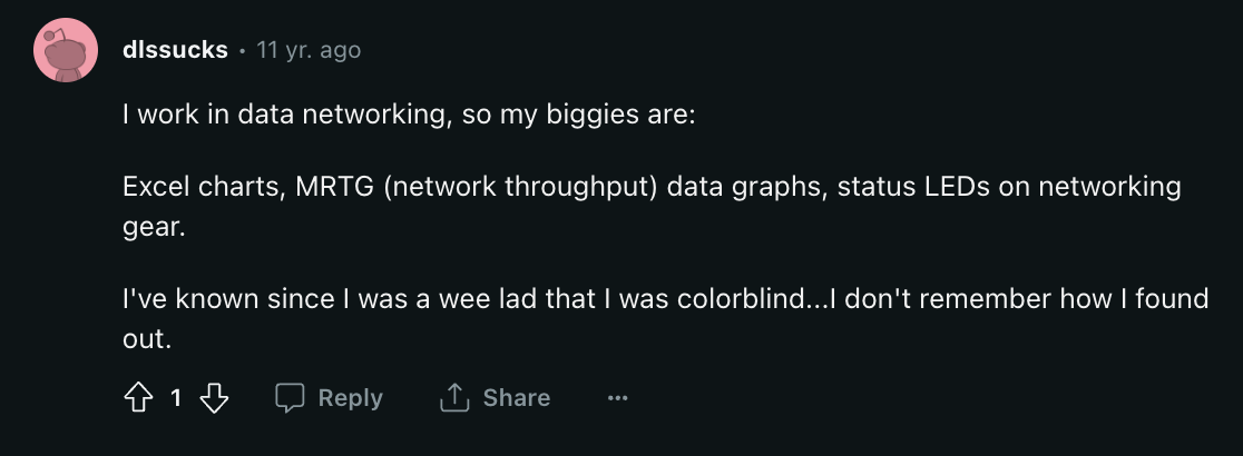
EXPLORING USER CHALLENGES THROUGH ONLINE FORUMS
To delve deeper into the lived experiences of individuals with colour blindness, I ventured into online forums where they casually discussed their daily struggles. The anonymity offered by these platforms potentially encouraged more honest and unbiased responses, providing valuable insights.
However, it's essential to acknowledge the limitations of this approach: the lack of participant verification could introduce potential inaccuracies.
Here were some of the responses:
To build an inclusive product, I took a two-pronged approach:
1. Deepening understanding:
Personal connections: Conversations with colorblind individuals provided firsthand insights.
Research immersion: Online forums and desk research expanded my knowledge base.
Target audience involvement: Continuous integration of user feedback ensured relevance.
2. Avoiding assumptions:
Empathy first: Acknowledging the complexity of the issue and respecting each individual's experience.
No shortcuts: Avoiding generalizations and stereotypes to design for specific needs.
This comprehensive approach ensured a product that is truly inclusive and addresses the concerns of the colorblind community.
STARTING MY RESEARCH JOURNEY
Having limited prior knowledge about color blindness (CVD), I needed to lay the groundwork for productive user conversations and interviews. To achieve this, I embarked on a thorough desk research phase, immersing myself in information about the different forms of CVD.
The main types are:
1. Reduced Color Sensitivity (Trichromacy):
Red-green difficulty: This includes Protanomaly (muted reds) and Deuteranomaly (muted greens). People often confuse these colors and their variations.
Blue-yellow difficulty: This is less common, with individuals struggling to distinguish between blue and yellow hues.
2. Complete Absence of One Color (Dichromacy):
Red: Protanopia: Individuals see reds as greens or black, making red-green differentiation extremely challenging
Green: Deuteranopia: Greens appear as yellows, browns, or grays, hindering red-green perception.
Blue: Tritanopia: Blues are seen as greens or grays, and yellows as reds or oranges.
3. No Color Vision (Monochromacy):
Achromatopsia: This extremely rare condition results in seeing only shades of gray, completely lacking color perception.
Important:
Severity varies within each type, and combinations can occur.
Rarer forms with complex symptoms exist.
Additional Information:
Red-green CVD is the most common, affecting around 8% of men and 1% of women. (Egyptian Journal of Medical Human Genetics, 2022)
Blue-yellow CVD is less frequent, impacting roughly 0.5% of the population. (Egyptian Journal of Medical Human Genetics, 2022)
Total color blindness (Monochromacy) is exceptionally rare, affecting about 1 in 100,000 people. (Egyptian Journal of Medical Human Genetics, 2022)

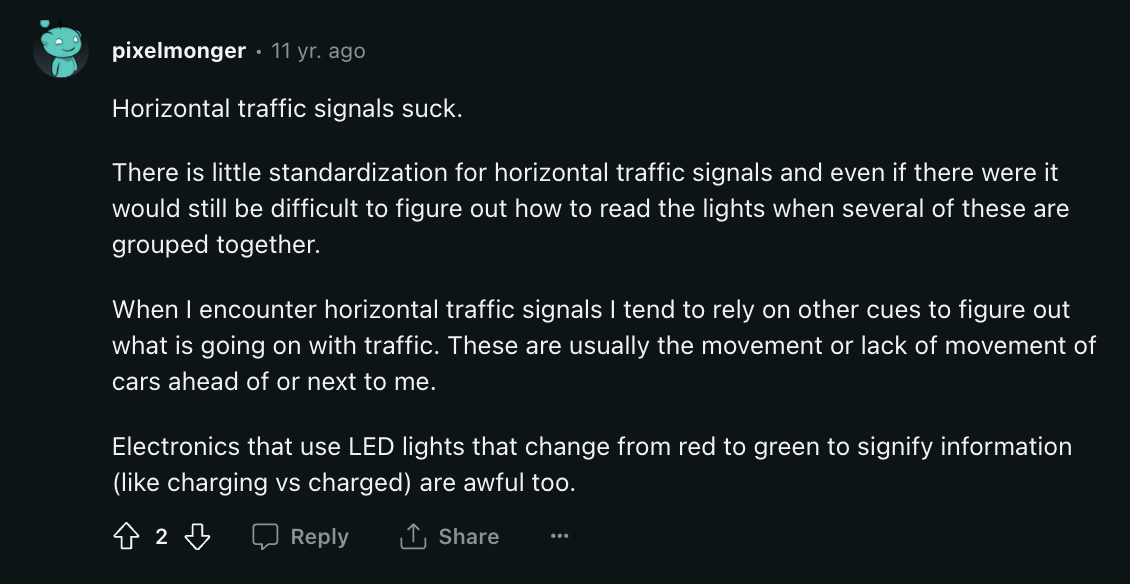
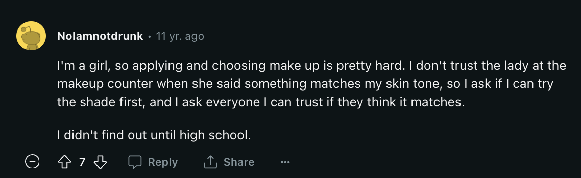
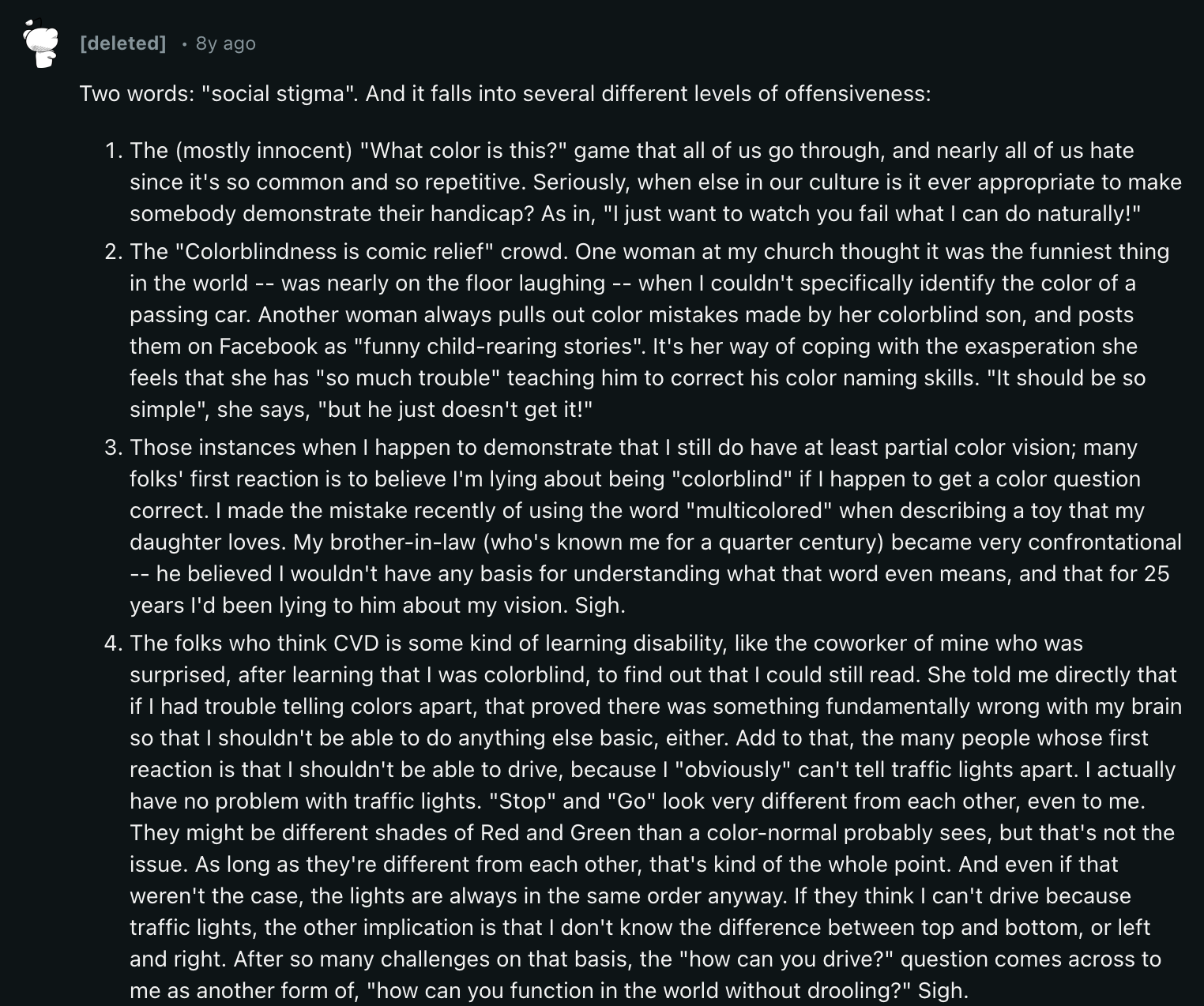

My exploration of online forums revealed a wide range of daily challenges faced by individuals with colour blindness, varying significantly based on their specific type of CVD. Outside of daily frustrations, users also commented on the social stigma faced and employment limitations. Their responses expressed the shared frustration of lacking a definitive solution and shed light on several prominent issues that came up constantly, in particular:

Colour Identification Apps
Positives
Readily available and often free
Portable and versatile - identifies colours on-the-go in various real-world situations.
Negatives
Can struggle with low light, complex colour combinations, and reflective surfaces.
Relies on a smartphone camera

Colour Overlays
Positives
Affordable and easily accessible
Can be used on physical objects, digital screens, and various surfaces.
Improves specific colour contrasts
Negatives
Cumbersome and a hassle
Only applicable to a limited amount of situations
May affect non-colourblind people

Colour Correction Glasses
Positives
Can be tailored to individual needs and type of colour blindness.
Efficient and convenient for daily tasks
Negatives
Can be expensive, harder to access
INTERVIEW
Building on my research, I conducted in-depth one-on-one interviews with 14 individuals experiencing various forms of colour blindness/CDV. The discussions explored their coping mechanisms and levels of effectiveness, the challenges they face, and how these impact both their daily lives and professional pursuits.
Key Findings from Colour Blind User Interviews:
Coping mechanisms:
While users develop strategies (labels, memorisation, apps), they often avoid colour-critical situations due to reliance on others or unreliable technology.
Users with Monochromacy rely on non-color cues, highlighting the need for diverse design solutions.
Challenges:
All users face low to moderate daily life difficulties, but work poses significant concerns to some users, regarding:
Safety hazards: Traffic signals, warning signs, electrical wiring, etc.
Career progression: Limitations in colour-dependent professions.
“I use apps that identify colours for me when needed. It's helpful, but can be slow and cumbersome."
Respondent with Deuteranopia
“I avoid situations where color differentiation is crucial. It's frustrating, but I don't want to rely on others all the time."
Respondent with Tritanomaly
“Work requires accommodations and careful job selection. I feel limited in certain career paths due to colour requirements."
Respondent from Interview
Those who used assistive technology were asked to analyse their effectiveness:

Produce Identification

Traffic signals (occupational safety hazard)

LED light differentiation (occupational safety hazard)

Information visualisation e.g data charts and graphs (potential employment issue)
PERSONAS & EMPATHY MAP
Through user research, I developed detailed personas based on real data and objective findings. This helped me mitigate my own biases and focus on the key needs and experiences of colourblind users.
By creating an empathy map using insights from the research, I gained a deeper understanding of the user's journey: their behaviours, thoughts, and feelings in daily activities. This detailed visualisation helped me prioritise user needs, motivations, and frustrations, ensuring a user-centred design process focused on the individuals I’m aiming to empower.

Empathy Map

Persona 1

Persona 2

Persona 3


Don’t forget to rest your eyes and take a break from scrolling…

PART 03: DEFINE
Brainstorming
AFFINITY DIAGRAM
After synthesising research data, I held a 10-minute brainstorming session focused on digital tools for colourblindness/CDV.
Key Findings:
Diverse Needs: Individuals have different types and severities of colour blindness, requiring varied solutions. The app needs to be adaptable.
Multi-Sensory Assistance: Going beyond just colour identification, the app can leverage sound, touch, and other senses for a more inclusive experience.
Personalisation and Customisation: Users should be able to tailor the app to their specific needs and preferences for optimal usefulness.
Addressing Limitations:
Current assistive technology often focuses on basic colour identification, which has limitations in complex situations like multitasking (e.g., driving).
This brainstorming emphasises multi-sensory assistance to overcome these limitations.
USER FLOW
Leveraging insights from the affinity diagram, I crafted a streamlined user flow, meticulously visualising achievable paths for colour-blind users navigating their daily tasks. I meticulously examined each click and step and removed unnecessary interactions to ensure more effortless navigation.

Affinity Diagram

User Flow Map
PART 04: DEVELOP
Ideation
Sketches
→
User Test
→
Visual Identity
Low-Fidelity
↓
User Test
→
High-Fidelity 2
→
High-Fidelity
Final Design Outcome
SKETCHES
Informed by user feedback's emphasis on accessibility and versatility, I began sketching application designs and wireframes to visualise the user flow and explore different layouts and functionalities.


LOW FIDELITY PROTOTYPES
A more detailed rendering was digitally crafted in the form of wireframes turned low-fidelity prototypes, focusing on information architecture and user flow. Alterations were made to ensure a smoother user experience and a cleaner, more intuitive user interface.
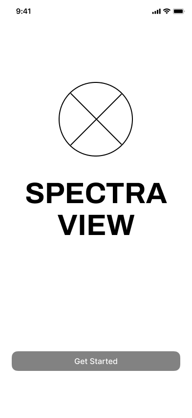
Welcome Screen
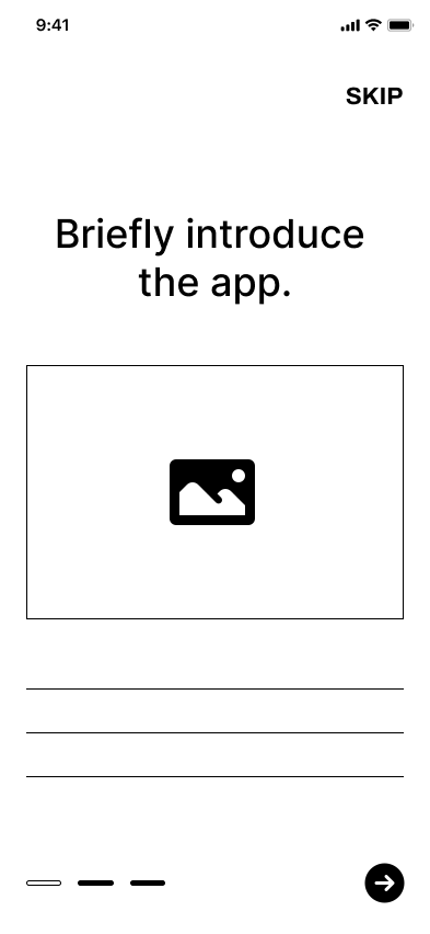
Introduction
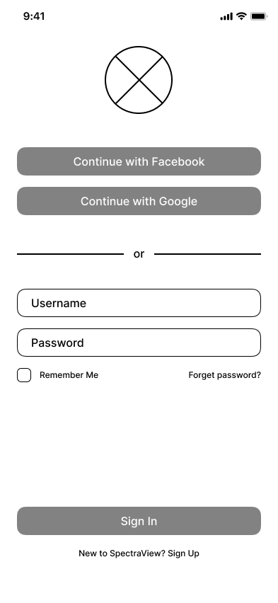
Sign In
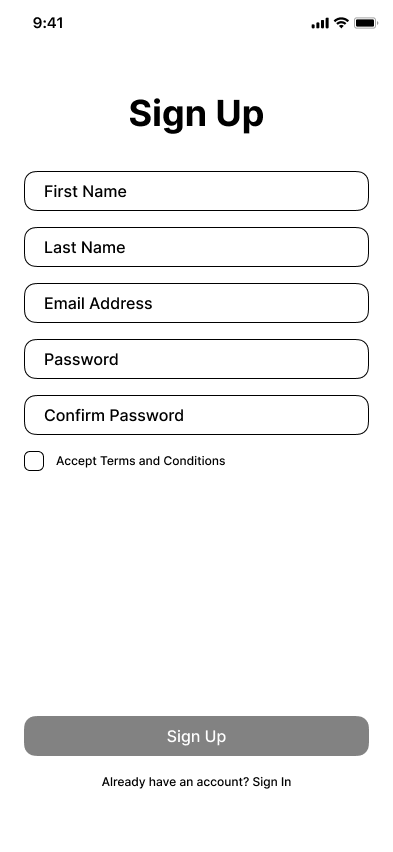
Sign Up

Profile Details

Profile Details 2
AR Colour Picker
AR Colour Picker - More Options
Smart Scanner
Enhanced Navigation
Scan Results
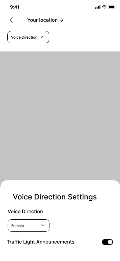
Voice Direction Settings

Saved Colours (Palette)

Saved Colours (Individuals)
Settings
USER FEEDBACK
To improve the low-fidelity prototype, I conducted usability studies with 12 participants with color vision deficiency (CVD). This helped me gain valuable insights into their mental models and identify areas for improvement in the next iteration.
User feedback is essential in this process, as it allows me to design with empathy. Without user testing, I would be relying on assumptions and biases, which could hinder the creation of a truly inclusive product.

Key Developments Based Off Feedback
The following changes were my focus to enhance the usability and user experience of SpectraView:
Increase User Control
Address the need for a zoom function to allow users to focus on small items of interest.
Implement a focus control for precise targeting of small objects.
Improve Icon Clarity
As the icons on the bottom row were unclear to many user, adding labels or revising the icons will help them become universally understood.
Terminology and Consistency
Ensure consistency of all terminology and icons. E.g rename "Settings" to "Profile" and include a profile icon for consistency with the profile details section.


Enhance Colourblind Accessibility
Implement detailed colour descriptions for the AR Colour Picker and Colour Palette features to increase their usefulness and accessibility to colour blind users.
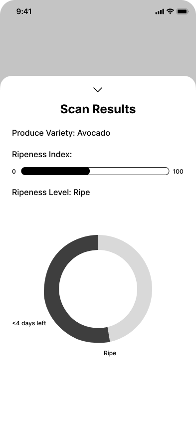
Ensure the Ripeness level chart is understandable at a glance by adding labels, legends, or using alternative colour choices.
BRANDING
I developed a visual identity of brand elements, including brand name, logo, typography and colour palette for consistent design execution. These were chosen with accessibility, harmony and balance in mind to cater to our target users, ensuring that I abide by WCAG guidelines.
ITERATION 1 - KEY DEVELOPMENTS
Incorporating key insights from user feedback, Iteration 1 of the final GUI addressed improvements in user flow, functionality, and user interface, building upon the initial wireframe and responding to user feedback.


USER FEEDBACK
For iteration 1, I conducted usability studies to gain a deeper understanding of users' mental models and address any pain points for the final outcome. Here’s the second round of usability studies:


Key Developments Based Off Feedback
The following changes were my focus to enhance the usability and user experience of SpectraView:
Increase Clarity
Improve the visibility of the colour picker and scanner crosshair on various backgrounds.
Rename "texture overlay" to "stripes overlay".
Eliminate confusions associated with the navigation feature and capture button to illustrate how it helps users.
Outline how to use the app and give an overview of the features in the introduction pages (also improves learnability).
Using descriptive terms like "mild," "moderate," and "severe" provides a more user-friendly way of self-assessment.
Enable Recovery from Errors
Implement confirmation prompts before irreversible actions like deleting data or changing settings, giving users a chance to double-check their decisions and avoid unintended consequences.
e.g Add a confirmation prompt before deleting palettes and offer recovery options.
Improve Colour Organisation
Implement a "Create Palette" function and allow users to create palettes from their saved individual colours.
Implement a system for organising saved colours, like folders or categories for future use.
Remove Redundant Functions
Remove the option to turn off "Shift Mode" as it's a core function.
Consider automatic light detection for the confidence gauge, eliminating the manual input button.
ITERATION 2 - KEY DEVELOPMENTS
The second iteration of the prototype made significant strides, with the final version boasting refined features, enhanced clarity and streamlined user flows. Unnecessary steps were meticulously eliminated, making for a more seamless experience.


PART 05: DELIVER
Final Design Outcome
Welcome Screen
App Introduction 1
App Introduction 2

Sign In

Sign Up

Profile Set Up 1

Profile Set Up 2

Colour Picker - Normal Shift
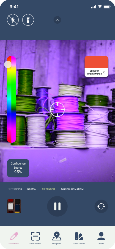
Colour Picker - Tritanopia Shift

Colour Picker - Monochromatism Shift
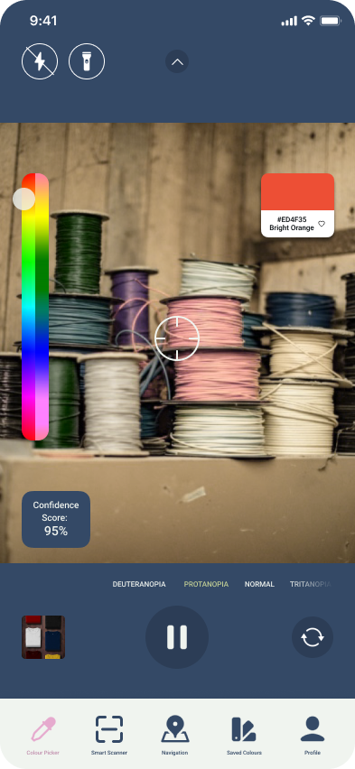
Colour Picker - Protanopia Shift
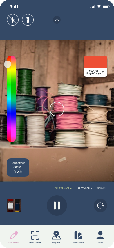
Colour Picker - Deuteranopia Shift

Colour Picker - Zoom

Colour Picker - Focus
Colour Picker Modes

Colour picker - Stripe Overlay

Colour Picker - Contrast Outline
Produce Scanner

Produce Scanner - Result

Produce Scanner - Detailed Scan Results

Enhanced Navigation
Enhanced Navigation - Search Results

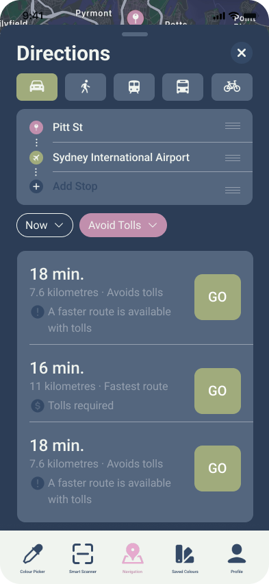
Enhanced Navigation - Directions
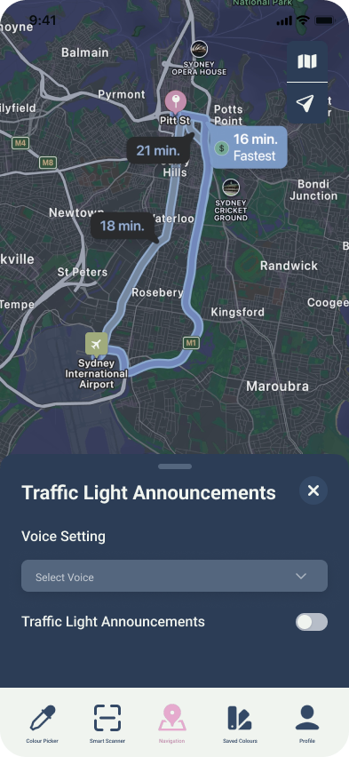
Enhanced Navigation - Traffic Light Announcements


Saved Colour Palettes

Saved Colour Palettes - Delete Confirmation

Saved Individual Colours

Saved Colour Palettes - Edit

Saved Individual Colours - Edit

Saved Individual Colours - Delete Confirmation
Profile
PART 06: DELIVER
Key Features
01
ONBOARDING & PROFILE SET-UP
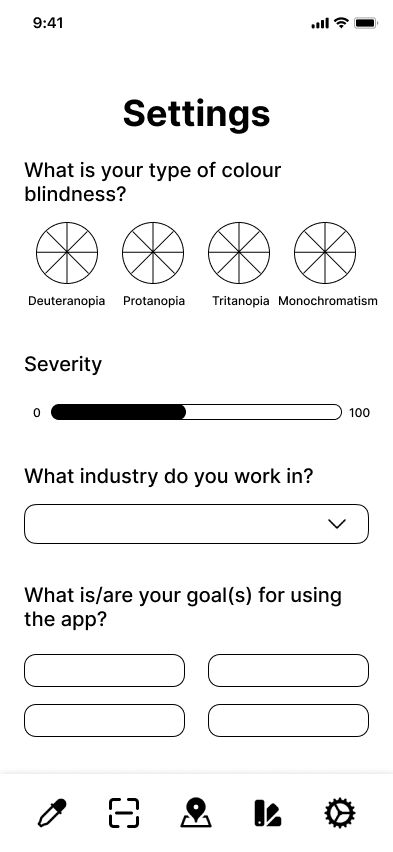
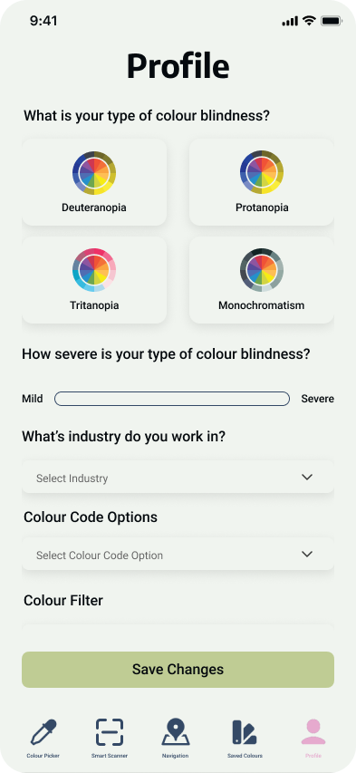
Users can sign in/sign up and save their information, creating a convenient access point for their personalised profile and SpectraView's features. Following signup, a questionnaire guides users through personalising their experience. This questionnaire considers the user's type of colour blindness, its severity, their industry, and their goals for using the app. Importantly, flexibility is offered as users can skip the app introduction of profile set-up.
02
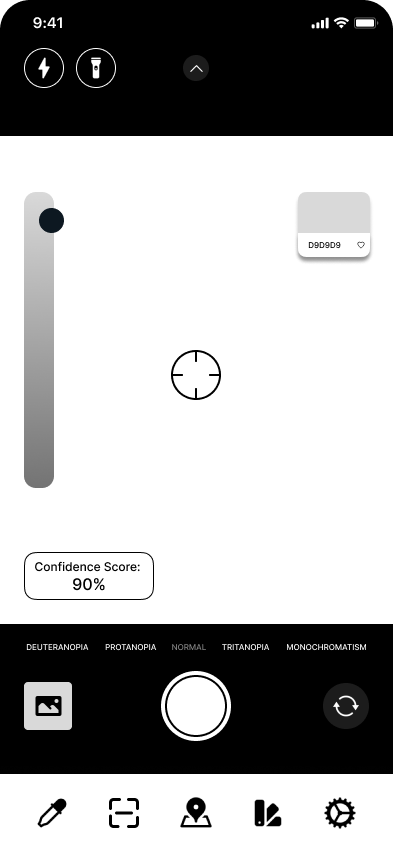
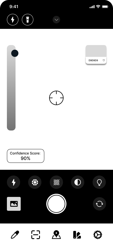
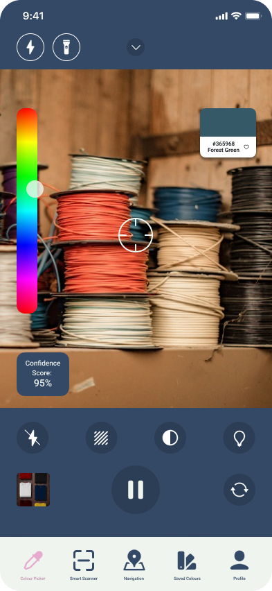
COLOUR PICKER
The colour picker dynamically analyses colours through the camera or from still image uploads. It then shifts the camera’s colours based on the user's type of colour blindness and displays a confidence score according to lighting conditions. The zoom feature further enhances the static colour capture mode by allowing users to focus on specific areas within an image for accurate colour analysis.
03
COLOUR PICKER MODES
Users can click the dropdown arrow to access additional options and modes that personalise the experience, offer flexibility, and assist in situations where precise colour picking is important. These options include a stripe overlay on a chosen colour or a contrast outline around a selected colour. Additionally, users can toggle adaptive brightness on or off, which automatically adjusts the camera based on lighting conditions to improve accuracy.
04
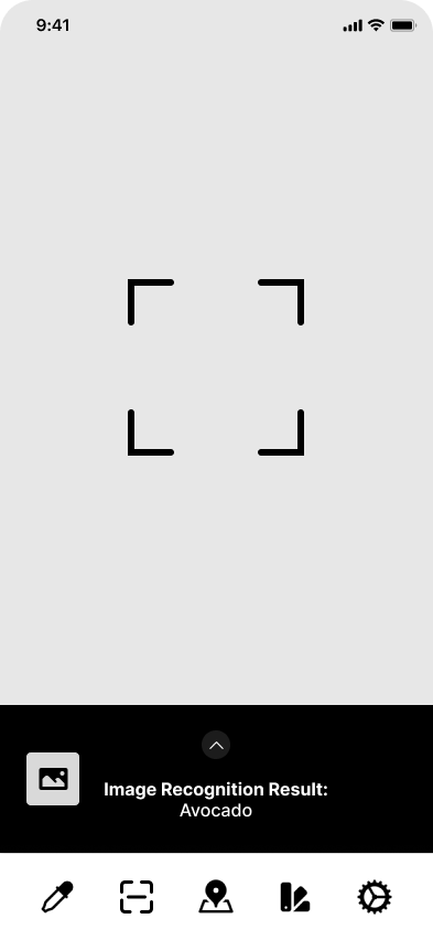
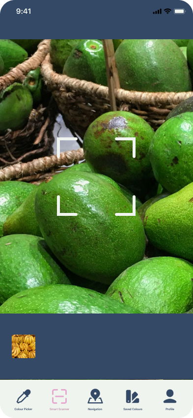
PRODUCE RIPENESS SCANNER
By leveraging their device's camera, colourblind users can feel empowered during everyday tasks like grocery shopping. A quick scan of any piece of produce initiates an analysis of its ripeness. Following a successful scan, a pop-up window displays comprehensive information about the scanned item, including the specific variety, a ripeness index (either numerical or visual), and the current ripeness stage. This detailed breakdown allows users to make informed decisions.
05
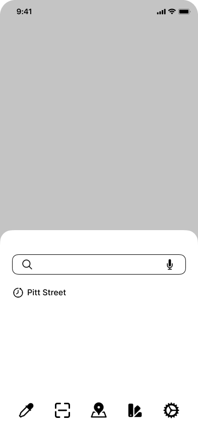
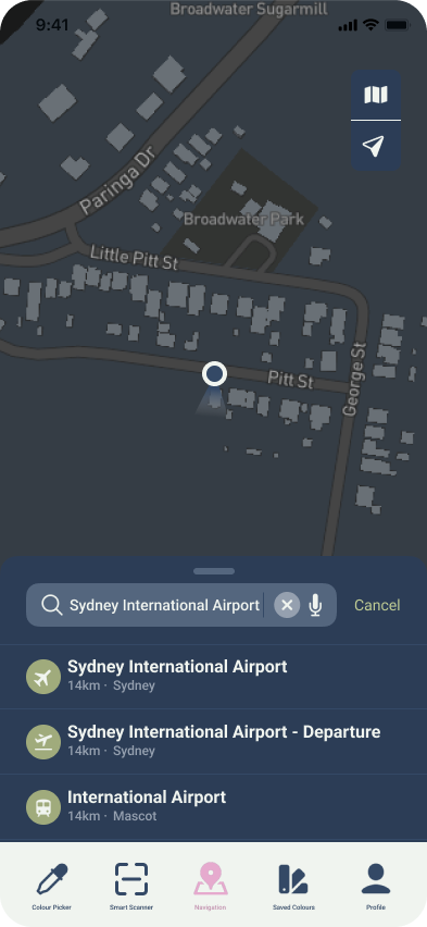
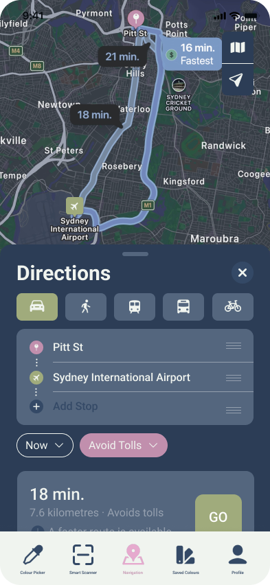
ENHANCED NAVIGATION
This feature includes audio cues that announce traffic light status, aiding users with red-green colour blindness in navigating and following directions with greater confidence.
06
SAVED COLOURS
SpectraView empowers creative workflows with a comprehensive colour palette system. Building on the colour picker, users can effortlessly save and organise captured colours to build custom palettes directly from their environment. Once created, palettes can be meticulously managed - duplicated, edited, shared with collaborators and deleted.
07
PROFILE
Users can access and modify profile settings at any time to personalise their experience. These settings include: colour blindness type, severity, industry, colour code options, colour filter preferences, and goals for using the app.
PART 07
Key Takeaways
When practising inclusivity and accessibility in design, practising empathy is crucial for informed design decisions.
Understanding user needs and avoiding assumptions ensures an inclusive product.
FURTHER DEVELOPMENTS


User Research
I want to conduct more user research with a more diverse user group to further my understanding of user needs.
Usability Testing
I’d like to conduct more usability testing on the high fidelity prototype with a more diverse user group to further refine the design.